
微信交流群

# 水平、垂直布局组件
Row 是将子组件以水平方式布局的组件, Column 是将子组件以垂直方式布局的组件。项目中 90% 的页面布局都可以通过 Row 和 Column 来实现。
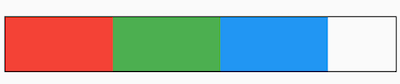
将3个组件水平排列:
Row(
  children: <Widget>[
    Container(
      height: 50,
      width: 100,
      color: Colors.red,
    ),
    Container(
      height: 50,
      width: 100,
      color: Colors.green,
    ),
    Container(
      height: 50,
      width: 100,
      color: Colors.blue,
    ),
  ],
)
2
3
4
5
6
7
8
9
10
11
12
13
14
15
16
17
18
19

将3个组件垂直排列:
Column(
  mainAxisSize: MainAxisSize.min,
  children: <Widget>[
    Container(
      height: 50,
      width: 100,
      color: Colors.red,
    ),
    Container(
      height: 50,
      width: 100,
      color: Colors.green,
    ),
    Container(
      height: 50,
      width: 100,
      color: Colors.blue,
    ),
  ],
)
2
3
4
5
6
7
8
9
10
11
12
13
14
15
16
17
18
19
20

在 Row 和 Column 中有一个非常重要的概念:主轴( MainAxis ) 和 交叉轴( CrossAxis ),主轴就是与组件布局方向一致的轴,交叉轴就是与主轴方向垂直的轴。
具体到 Row 组件,主轴 是水平方向,交叉轴 是垂直方向。而 Column 与 Row 正好相反,主轴 是垂直方向,交叉轴 是水平方向。
明白了 主轴 和 交叉轴 概念,我们来看下 mainAxisAlignment 属性,此属性表示主轴方向的对齐方式,默认值为 start,表示从组件的开始处布局,此处的开始位置和 textDirection 属性有关,textDirection 表示文本的布局方向,其值包括 ltr(从左到右) 和 rtl(从右到左),当 textDirection = ltr 时,start 表示左侧,当 textDirection = rtl 时,start 表示右侧,
Container(
  decoration: BoxDecoration(border: Border.all(color: Colors.black)),
  child: Row(
    children: <Widget>[
      Container(
        height: 50,
        width: 100,
        color: Colors.red,
      ),
      Container(
        height: 50,
        width: 100,
        color: Colors.green,
      ),
      Container(
        height: 50,
        width: 100,
        color: Colors.blue,
      ),
    ],
  ),
)
2
3
4
5
6
7
8
9
10
11
12
13
14
15
16
17
18
19
20
21
22
黑色边框是Row控件的范围,默认情况下Row铺满父组件。
主轴对齐方式有6种,效果如下图:
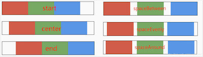
spaceAround 和 spaceEvenly 区别是:
- spaceAround :第一个子控件距开始位置和最后一个子控件距结尾位置是其他子控件间距的一半。
- spaceEvenly : 所有间距一样。
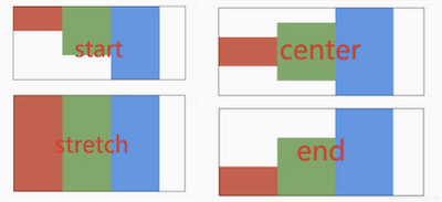
和主轴对齐方式相对应的就是交叉轴对齐方式 crossAxisAlignment ,交叉轴对齐方式默认是居中。Row控件的高度是依赖子控件高度,因此子控件高都一样时,Row的高和子控件高相同,此时是无法体现交叉轴对齐方式,修改3个颜色块高分别为50,100,150,这样Row的高是150,代码如下:
Container(
      decoration: BoxDecoration(border: Border.all(color: Colors.black)),
      child: Row(
        crossAxisAlignment: CrossAxisAlignment.center,
        children: <Widget>[
          Container(
            height: 50,
            width: 100,
            color: Colors.red,
          ),
          Container(
            height: 100,
            width: 100,
            color: Colors.green,
          ),
          Container(
            height: 150,
            width: 100,
            color: Colors.blue,
          ),
        ],
      ),
    )
2
3
4
5
6
7
8
9
10
11
12
13
14
15
16
17
18
19
20
21
22
23
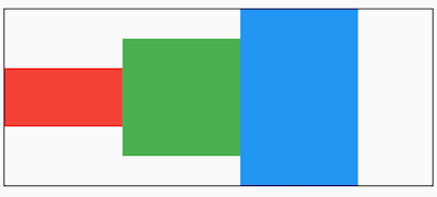
主轴对齐方式效果如下图:
mainAxisSize 表示主轴尺寸,有 min 和 max 两种方式,默认是 max**。**min 表示尽可能小,max 表示尽可能大。
Container(
	decoration: BoxDecoration(border: Border.all(color: Colors.black)),
	child: Row(
		mainAxisSize: MainAxisSize.min,
		...
	)
)
2
3
4
5
6
7

看黑色边框,正好包裹子组件,而 max 效果如下:
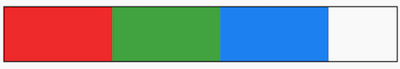
textDirection 表示子组件主轴布局方向,值包括 ltr(从左到右) 和 rtl(从右到左)
Container(
  decoration: BoxDecoration(border: Border.all(color: Colors.black)),
  child: Row(
    textDirection: TextDirection.rtl,
    children: <Widget>[
      ...
    ],
  ),
)
2
3
4
5
6
7
8
9
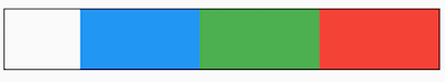
verticalDirection 表示子组件交叉轴布局方向:
- up :从底部开始,并垂直堆叠到顶部,对齐方式的 start 在底部,end 在顶部。
- down: 与 up 相反。
Container(
  decoration: BoxDecoration(border: Border.all(color: Colors.black)),
  child: Row(
    crossAxisAlignment: CrossAxisAlignment.start,
    verticalDirection: VerticalDirection.up,
    children: <Widget>[
      Container(
        height: 50,
        width: 100,
        color: Colors.red,
      ),
      Container(
        height: 100,
        width: 100,
        color: Colors.green,
      ),
      Container(
        height: 150,
        width: 100,
        color: Colors.blue,
      ),
    ],
  ),
)
2
3
4
5
6
7
8
9
10
11
12
13
14
15
16
17
18
19
20
21
22
23
24

想一想这种效果完全可以通过对齐方式实现,那么为什么还要有 textDirection 和 verticalDirection 这两个属性,官方API文档已经解释了这个问题:
This is also used to disambiguate start and end values (e.g. [MainAxisAlignment.start] or [CrossAxisAlignment.end]).
用于消除 MainAxisAlignment.start 和 CrossAxisAlignment.end 值的歧义的。
版权所有,禁止私自转发、克隆网站。